04 / Civic mapping identity
Urban Commons.
Making the marginalised
in our cities visible.
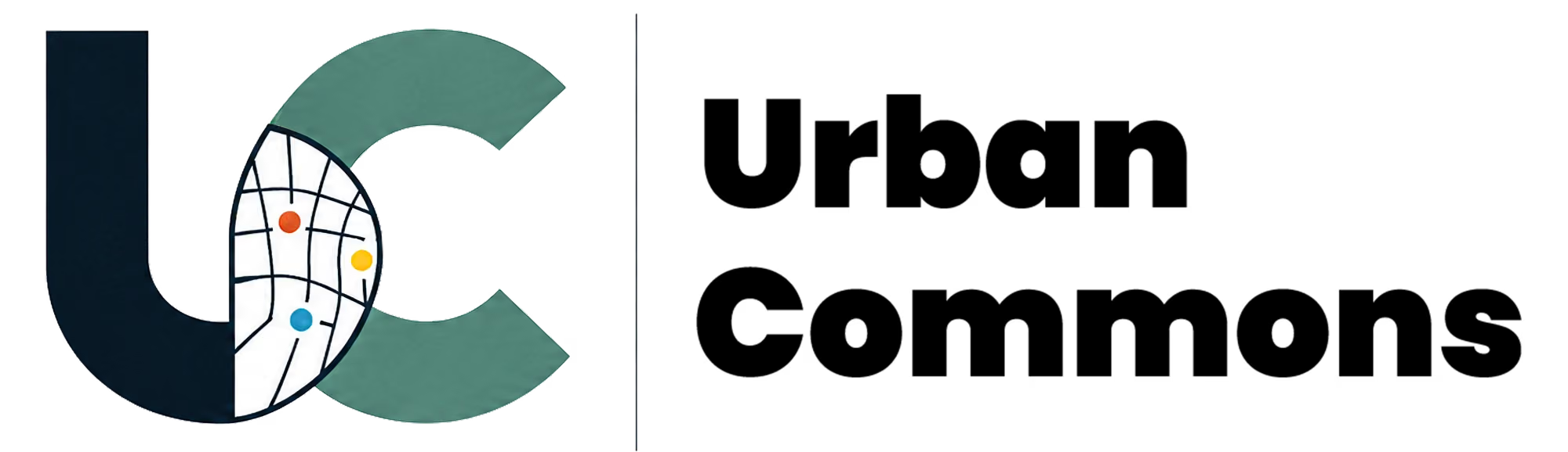
A visual identity for a civic mapping platform in development. The UC initials, a street network and three coloured points bring the name into a language of places and connections.
Making the Marginalised In Our Cities Visible.
- My role
- Logo design & visual identity
- Design tool
- Adobe Illustrator
- Scope
- Wordmark, symbols, colour studies & app icons
01 / The mark
Initials connected by a city.
The U and C overlap around a street network. Coloured points give individual places a visible presence within the larger whole.
 Vector colour study
- 01 Two initials
- U and C carry the name Urban Commons in a compact, recognisable form.
- 02 A street network
- Intersecting lines connect the letterforms to the urban places the platform explores.
- 03 Points of interest
- Orange, yellow and blue points bring attention to individual locations within that network.
02 / Colour & variants
A mark for different settings.
Light and dark app icons, a map pin and a monochrome emblem adapt the identity to different settings. Navy and teal connect the colour versions.
Navy#042A41
Teal#429686
White#FFFFFF
Orange#EC5C25
Yellow#FCBB1B
Blue#029DDC




Original Urban Commons artwork, with a map-pin application developed from the same mark.